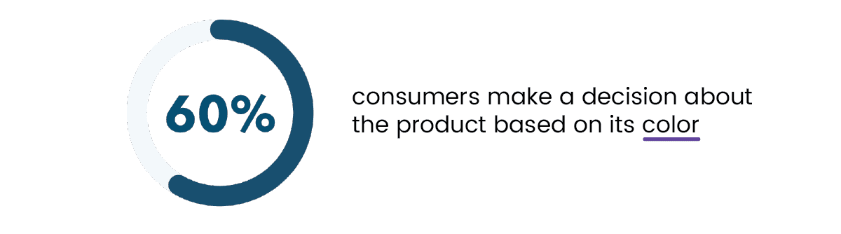
Research shows that “people make a snap judgment about a brand or product in just 90 seconds, with over 62% of consumers basing their decision primarily on color.”
This means you have a mere two minutes to captivate a potential customer, with color playing a critical role in that brief interaction.
Several brands have successfully turned their colors into iconic trademarks. For example:
- Cadbury Purple
- Barbie Pink
- Tiffany Blue
Colors can trigger instant emotional responses, whether they are conscious or subconscious.
However, these responses are shaped by cultural contexts, personal experiences, and even evolutionary factors. This leads to a crucial question: how do you tailor these broad color associations to suit your specific target audience?
Navigating the Challenges of Color Psychology in Marketing
Colors are inherently subjective, and their meanings can vary widely among different individuals. Studies on color psychology reveal that factors such as demographics, personal experiences, and cultural backgrounds significantly influence how colors are perceived.
Thus, applying broad color meanings—like assuming green always conveys sustainability or yellow signifies joy—may not be effective without understanding your audience. For instance, green is used by Quickbooks , a brand focused on finance rather than environmental themes. Similarly, while brown is often linked to leather goods, it is also used by brands like M&Ms and Nespresso to evoke appetite and warmth.
Ultimately, selecting the right color palette for your brand involves more than just adhering to general color associations. It requires a strategic approach that aligns with your audience’s unique perceptions and preferences.
Factors Influencing Color Preferences and How to Choose the Right Color for Your Brand
Color preferences are influenced by a multitude of factors, including gender, societal norms, and demographics. Understanding these factors can help you make more informed decisions when selecting colors for your brand.
Gender Influences
Research indicates that color preferences often vary by gender. Typically, men are drawn to bold and strong colors such as blue, green, and black, which are associated with qualities like stability and authority. On the other hand, women generally prefer softer, more lighter hues. While blue, purple, and green are popular among women as well, lighter shades and softer tones are often favored for their associations with calmness and creativity by women.
Societal Influences
Societal norms and stereotypes significantly shape color preferences. Traditional associations, such as pink for girls and blue for boys, influence how people perceive and select colors. These norms affect everything from fashion and toys to marketing and branding strategies. Understanding these societal influences is crucial for developing effective brand colors that resonate with your target audience.
Demographic Factors
Colors can carry different meanings across various cultures. For instance, in Western cultures, white is often linked with purity and weddings, whereas in some Eastern cultures, it is associated with mourning. Similarly, while red symbolizes good fortune in China, it might represent danger in other contexts. Recognizing these cultural connotations is essential for brands operating on an international scale. Regional color preferences can also vary based on local traditions, environmental factors, and historical contexts. For example, earthy tones might be preferred in nature-centric regions, while vibrant colors could be more popular in areas known for their rich cultural festivities.
So what is the right way to choose a color for your brand?
The answer might disappoint you, but it depends!
On the context and concept of your brand. It depends on the feeling you want to create when people first learn about your brand. It is “branding” yourself and your values rather than limiting it to a color, that may or may not stir the emotion you want.
How well a color works for your brand depends on how appropriate it is in relationship to the product. According to research, consumers react to colors based on how appropriate it is in the context of the product.
For example, consumers would be more inclined towards beauty products in a pastel and feminine tone rather than the ones having strong earthly tones. Similarly, you are more likely to trust a sustainable brand with earthly tones than the one branded in yellow or red.
So when deciding on a color of your brand, ask yourself “ is this relevant to what I am selling”?
Some Practical Examples
- Coca-Cola: Uses red to evoke excitement and energy, which is perfect for their dynamic and lively brand personality.
- Apple: Relies on minimalist white and black to convey sophistication and modernity, reflecting their sleek and high-end products.
- Whole Foods: Uses green to emphasize its commitment to health and sustainability, aligning with its natural and eco-friendly brand ethos.
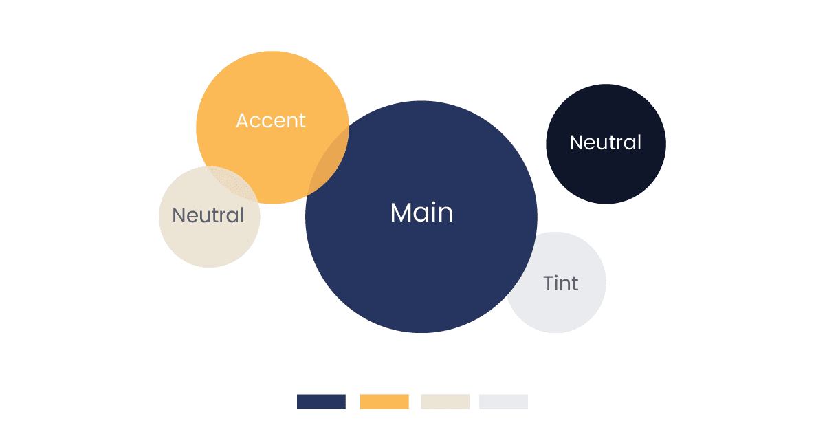
The framework for Selecting your Brand Colors
Now that you have taken into context the above, you can use this general framework to choose your brand colors for design, branding and marketing.
- Base
This is the most important color of your brand. Your base color reflects the values, personality traits, and concepts of your brand. This base color should align with color psychology, its hue or tone should align with your consumer’s perception of that color and also be appropriate to your product. Similarly, the base color defines how the other colors play out with it in design and marketing.
- Accent
The accent color is either a complementary or monochromatic colors that brings out the best of your base color. It is as important to color as the base as it also reflects the personality traits of your brand and consumer.
- Neutrals
Neutral colors are subtle tones of white and blacks that are supposed to be in the background, not calling for extra attention. Neutral colors are used in combination with base and accent colors to balance the design.