Pantone Vs. CMYK: Which Color System is Right for Your Custom Packaging
One of the hardest parts about packaging is understanding the color matching system and the various printing techniques. Our customers often feel overwhelmed by the various terms used for printing techniques—CMYK, RGB, Pantone Hex, etc.
The truth is, there is no way to avoid this. But what we can help with is providing a helpful guide on both color matching systems that explains the importance of both in packaging, and how you can use them to your advantage.
The Two Color Matching Systems
One of the most important things to understand is the primary difference between CMYK & PMS- which is the accuracy of color. Let’s break both to understand this difference:
Pantone Color System
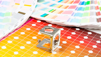
Having a universally standard color language, the Pantone Matching System consists of pre-mixed colors that are ready for use without any additional intervention or blending techniques. This allows designers, printers, and manufacturers to achieve color consistency across different outputs in print. This leads to more vibrant tones, especially for subtle shades and special finishes like metallics and fluorescents.
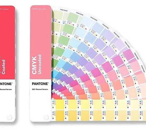
In the Pantone color system, you can choose from an extensive collection of more than 1000 shades, each having its unique number that makes it easier for printing press across the globe to achieve the exact same accuracy in output.
Best Use Cases:
It is best used for fluorescent, grey, and brown colors. If your brand is looking to achieve color consistency across all outputs, Pantone is the way to about. Several brands choose to have their logos and trademarks identified by a certain Pantone, to ensure consistent branding and color representation.
Here is an example that woul make sense:
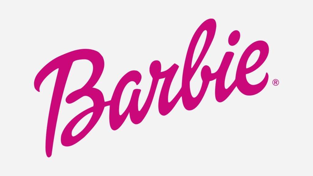
We are all familiar with the perfectly feminine pink of Barbie. It is bright, bold and just the right tone. The color has earned so much popularity that it now infact is the trademark cultural icon that has become synonymous with the more than 150 million dolls sold each year by the brand.
Now if Barbie were to create custom packaging for one of its products, can it risk the accuracy of its pink? Certainly not. So in such cases where branding plays the central role in your packaging, choosing to go with the Pantone color matching system is the ideal way to go about it. Unless you want to be creative and play with a different color palette using secondary colors of the brand.
Here is another example from the Mailer Box portfolio. Lindt came to us for its super-sized collapsible rigid box packaging for its classic milk chocolate. They needed the box to be the same color as their product. And to accurately achieve that, we worked with Pantone to deliver just the right blue.
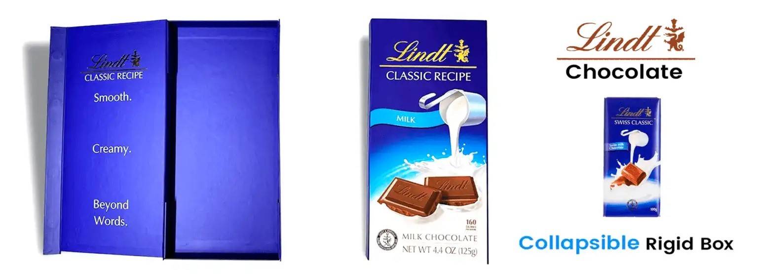
Read more about this packaging on our blog.
CMYK Color System
CMYK is short for Cyan, Magenta, Yellow, and Key (Black). If you have ever used Photoshop or Illustrator, you would see the fields of CMYK mentioned in the color section where you can adjust the percentages of each.. The four colors quoted are layered in different percentages to blend and make the desired shade.
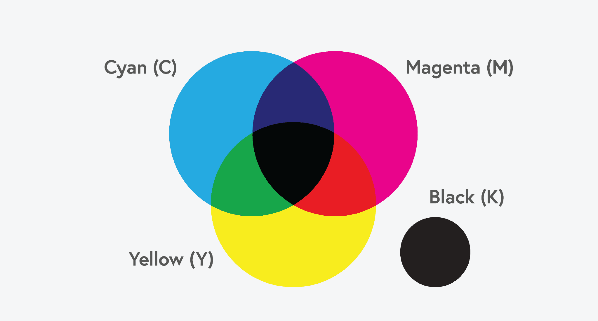
In printing, layers of tiny dots are created with ink to achieve the desired output. The higher the number of dots, the darker the resulting hue, which is why it is categorized as a subtractive color system. This layering technique allows to play with a broad range of colors however determining the accuracy of output is challenging.
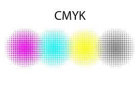
CMYK is commonly used in printing projects with complex images, such as full-color photographs, where a mix of colors can create a nuanced output. Appearing tiny dots layered upon each other, they blend to make the desired shade and color output.
Larger prints or printed collateral such as brochures, flyers and magazines where precision of color is not that much of an issue, CMYK is ideal. In packaging however, you may have to carefully decide if this color matching system is the right one for you. In cases where you choose to go with neutral colors or sustainable packaging- such as kraft paper, CMYK can work well.
Which one to choose- The Pros & the Cons for Packaging
Pros of Pantone:
If you are looking for extreme color accuracy, with no risks of differences at all, then choose Pantone. It ensures color accuracy across different print jobs and materials, vital for brand integrity.
Similarly, because colors are accurate and pre-mixed, they are mostly more vibrant. Such a variety is difficult to achieve with CMYK, especially with effects like metallics. Each color is printed using a dedicated ink, requiring less complex mixing on the press, thus reducing the chances of error in color reproduction.
Cons of Pantone
With Pantone one of the biggest disadvantages is of course the cost. Pantone color matching system is generally more expensive than CMYK, especially for small print runs as each color must be set up individually.
Similarly, if you want to experiment with a wide spectrum of colors and add special effects like gradients, patterns, or more than two colors, it can be an issue to achieve that with the Pantone color system.
Pros of CMYK
We mentioned above that cost is the biggest disadvantage of Pantone colors, however, the opposite is true for CMYK. CMYK is more economical in terms of cost and customization. You can run larger units of prints in multiple colors.
Similarly, if you have detailed graphics with different design elements and visual effects, CMYK gives you a better output. So if your packaging contains aesthetic customizations such as illustrations, patterns, and typography, it is best to opt for CMYK printing.
However the ideal use case of CMYK is that for marketing collateral such as magazines, flyers, stationary and photographs where it is imperative to mix colors and bring about the best possible blending of various shades.
Cons of CMYK
We have already discussed above that the accuracy of color in CMYK is one of the most challenging aspects of this color matching system. And how different each printed output looks varies by the material used and the printer you choose This is particularly troublesome for brands who switch between vendors for their printing and packaging jobs, but wish to maintain consistency in their brand representation. For example, you have a standard packaging design for your skin care product but you change your packaging vendor each time. The chances of variability of output are much higher with CMYK colors and your packaging is mostly likely to not look similar to that of the previous one.
Another issue is achieving vibrancy with CMYK. This is especially true for metallic shades and fluorescent colors. So if you are looking for vibrancy, it is best to settle with less intricate designs that you can print using Pantone palette.
The Big Question: How to Choose the Right Color Matching System for Your Custom Packaging
There are several factors that brands need to consider before deciding between the two color-matching systems. Here are the 3 key factors:
- Brand Consistency
If the central element of your packaging design is the logo or trademark, then it is best to rely on Pantone. Because mostly when brands have minimal packaging with emblems, they choose their primary brand color as the background color of the box. In such cases, compromising the integrity of brand color can be the wrong choice.
However, if you choose to play around with designs with intricate elements that have a variety of colors, CMYK would be the right choice. Designs with gradients and multiple colors are effectively blended in the press using the CMYK color system.
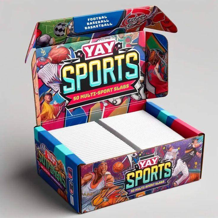
Let’s take an example of the following rigid box we design for Yay Sports. It consists of various colors and a detailed illustration. This surely had to go in the CMYK printing process that achieving such detailed blending would not be possible with Pantone.
Material Choices
Material is one of the most important elements of packaging. It not only makes or breaks the packaging but also lays the foundation for your printing choices.
As we discussed above intricate designs come out best using CMYK, they are also printed best on materials such as cardboard, art cards and bleach-white corrugated sheets. However, in the case of sustainable materials like Kraft Paper, Pantone is the ideal choice of color as it appears bolder and brighter on the otherwise dull surface.
Regardless of the chosen color system, obtaining samples beforehand can mitigate discrepancies between what is seen on screen and the final printed product.
Consult with us:
Consult with the Mailer Box for a more detailed consultation.
Our creative experts are happy to help you decide which of the two color matching system is the best for your packaging. Get in touch with us today for a free design and packaging consultation.

Ayesha Khubaib
Ayesha has a diverse experience in areas of marketing and management. Over the years, Ayesha has been involved in the packaging sector in various capacities and now aims to share packaging market insights with her readers
Get in touch with a custom packaging specialist now for a free consultation and instant price quote.

