The Growing Power of Minimalism and Monochrome in Custom Packaging
As a designer in the custom packaging industry, I’ve seen firsthand how minimalism and monochrome aesthetics can redefine a brand’s identity and capture consumer interest. With the world inundated with overwhelming choices, a well-crafted minimalist custom box stands out, making both a visual and emotional impact.
Although the idea is to leverage the trend in custom packaging these days, minimalism is always and forever a classic that one can never get enough of.
A Shift in Consumer Preferences from Too Much to Minimal
If you’ve recently wandered down the aisles of a grocery store or browsed through an online shop, you may have noticed a striking change—a shift towards minimalistic packaging. Consumers today are bombarded with choices and corresponding packaging that often overwhelms rather than informs. In a world cluttered with noise, minimalism offers a breath of fresh air.
Imagine standing in front of two shelves: one brimming with vibrant colors, bold fonts, and graphics that compete for your attention, while the other presents a cohesive, serene palette of whites, blacks, and subtle greys. Which one speaks to you? The odds are that you’re more likely drawn to the latter. This phenomenon isn’t just a personal preference; it reflects the broader cultural movement toward sustainability, mindfulness, and conscious consumption.
People are becoming more selective about their purchases, often seeking products that align with their values—ethically sourced, environmentally friendly, and aesthetically pleasing. Brands embodying these principles through their packaging are not merely selling products but conveying a lifestyle.
So, what exactly is Minimalist Packaging?
At its core, minimalism is about stripping away the non-essential elements to focus on what truly matters. It’s about clarity, quality, and functionality. Every choice you make—from materials to typography—should serve a purpose when designing for minimalism. Custom boxes offer an incredible opportunity to brands to create a balance between their product design and product packaging by opting for a minimal approach for the latter.
Take a moment to think about your favorite package design. What do you love about it? Is it the crisp lines, the spacious layout, or the lack of unnecessary decorations? The minimalist design prioritizes these qualities, creating an intimate connection between the product and the consumer. It highlights what is significant and discards what is irrelevant. By utilizing straightforward design language, brands can communicate their message quickly and effectively, engaging customers at a glance.
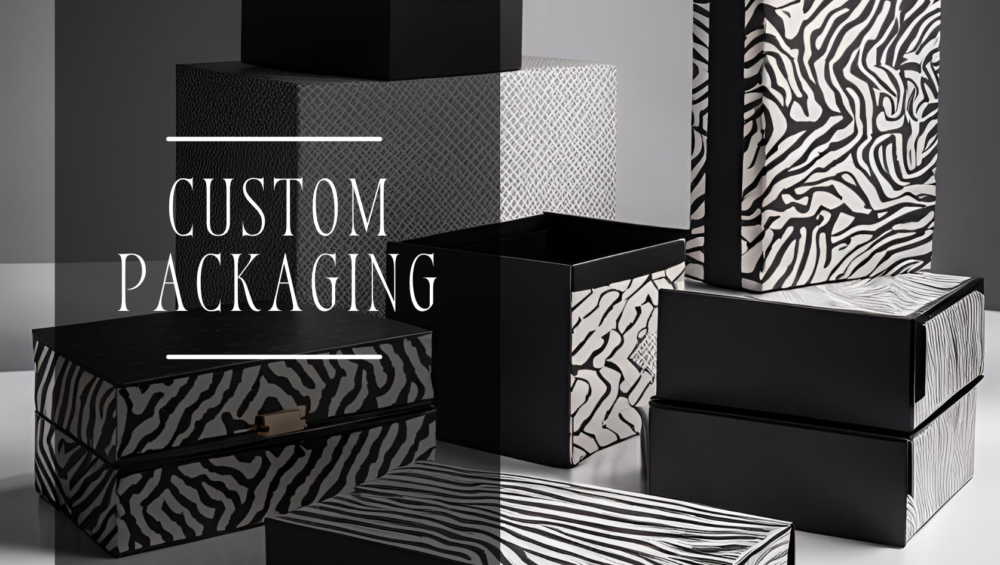
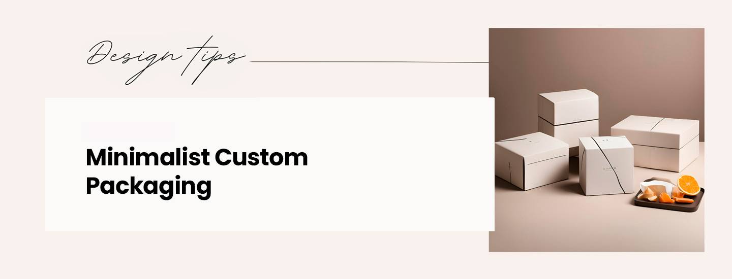
The minimalistic approach also caters beautifully to monochrome palettes (which is my favorite part). Using shades of a single color or black and white simplifies the design and creates a classic elegance that elevates the brand perception. Monochrome custom packaging can be striking, enhancing visual recognition while ensuring that the product takes center stage. Think about iconic designs like cosmetics and luxury beverages that utilize this palette effectively—each item communicates sophistication effortlessly.
Getting Started with Minimal & Monochrome Designs in Custom Boxes
Let’s consider some practical applications of minimalism and monochrome themes in custom boxes to get the creative juices flowing. Here are a few ideas to inspire you:
The Choice of Material
The tactile experience begins with the materials used. Opt for high-quality, sustainable materials that look and feel good. One of our favorite pieces from the Mailer Box collection is this D’Karla jewellery box. (Embed this link as an image.)
The client chose to go with textured cream cardboard with a logo in hot foil stamping. With a product that is bold, vibrant, and literally “shining,” there couldn’t have been a better choice.
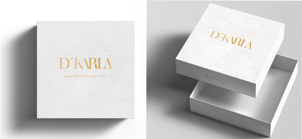
The inside of this custom box had another monochrome and minimal floral pattern that enhanced the essence of the product rather than overpowering it. The choice of material plays a great role here. The box is made from premium-quality cardboard that appears luxurious just by virtue of its texture and weight.
Similarly, if you are looking for a sturdy outlook in a monochrome palette, you can always need more rigid box custom packaging. Rigid boxes get their popularity from the strength and resistance they offer to products, as you may have experienced them being the primary material for electronics, jewellery and other luxury items. However, for me, what stands out is how it makes every design choice look absolutely stunning. You can print it in solid or enhance it with embossing; the exquisite nature of the material will give you the best look.
Another important material choice is sustainability. Today’s consumers are increasingly eco-conscious. Embracing sustainability in your packaging design appeals to consumer sensibilities and enhances your brand’s reputation. Consider materials like recycled cardboard or plant-based inks to tell a story of environmental responsibility alongside minimalism.
Enhance it with Type and Finish:
When choosing typefaces, I favor simplicity. Sticking to one or two fonts creates a clean presentation, but the trick is to select styles that resonate with the brand’s personality. For instance, a modern product might benefit from a sleek, minimalist font, while a more traditional brand can embrace classic serif fonts.
Here is another example of customized boxes designed for skincare products:
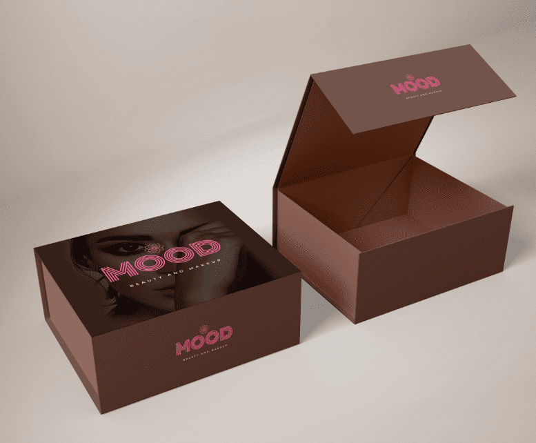
Radiance Aesthetics specializes in wellness and skincare products. The brand has a very minimal and clean outlook, with typography being the central element of the design. How and where the font is placed on the packaging changes its entire look and feel. For this box, we have experimented with a sustainable kraft material coated with premium white paper with a bold serif font that commands attention and communicates confidence, especially for a crowded marketplace. Keeping the text minimal not only aids readability but also enhances sophistication and luxury, which we have surely achieved with our customized boxes.
Additionally, implementing finishing techniques such as embossing or foil stamping adds that extra luxe touch without overwhelming the design. You’d be surprised at how a subtle textured finish or a hint of shininess can transform custom boxes from basic to extraordinary.
Playing with Textures:
When I first started exploring minimalist packaging, I realized that texture could be a game-changer for customized boxes. It’s not just about what you see; it’s about what you feel. Think about holding a well-designed package—smooth, rough, soft, or textured. These tactile sensations can tell a story and evoke emotions before the consumer even opens the box.
For instance, I’ve experimented with a variety of textured papers and finishes. One standout moment was when we designed this luxury rigid box for Color.
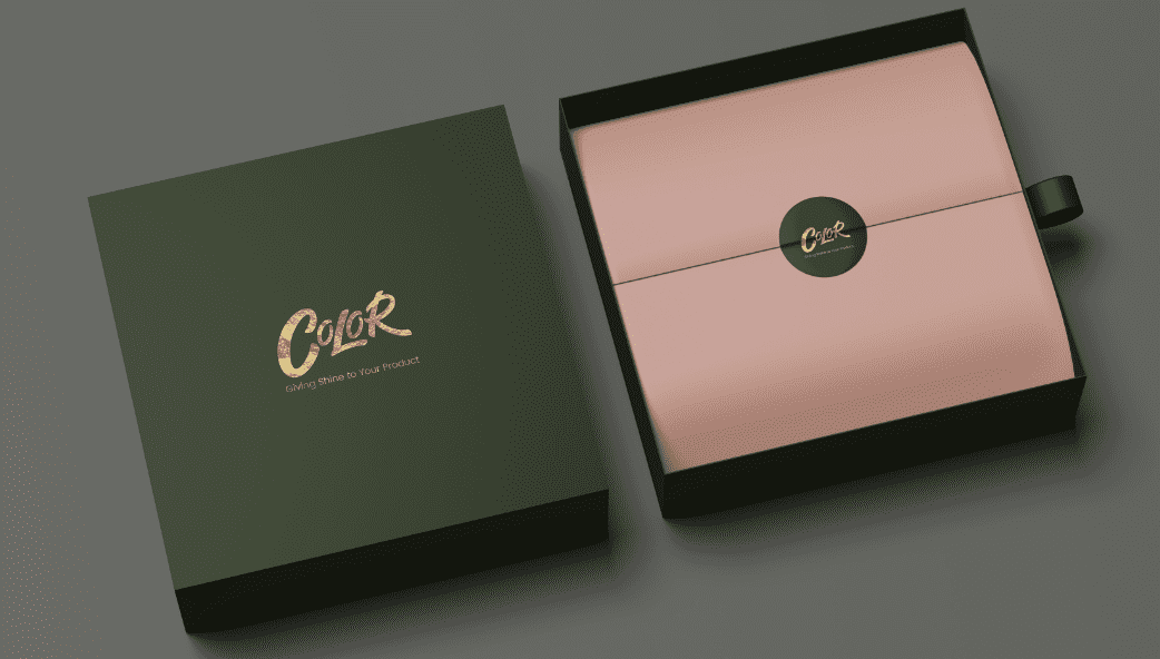
The smooth and silk-like feel of the paper not only communicated our commitment to quality but also created an inviting experience for the consumer. When customers run their fingers over the box’s surface, it makes a luxurious charm that instantly enhances the product’s perceived value. The balance of deep dark brown with cream contrast and hot foil is just the right balance brands should aim to achieve. Transparency is another textural element worth exploring. Custom packaging with a clear panel revealing the product inside create anticipation.
Color Accents:
Color has an incredible ability to influence perceptions and emotions. While minimalism is often understood to have muted color palettes, integrating strategic color accents can elevate a brand’s presence in a competitive market. Customized boxes with bold accents inevitably attract greater attention thereby increasing the probability of sale.
Using color in accents, such as the logo or essential product details, can guide the consumer’s eye to what matters. However, one important lesson when integrating color accents in custom packaging is that the pop of color should make sense—reflective of the product itself or the intended consumer experience. If the product is fresh, light, and rejuvenating, a soft pastel might work wonders, while a bolder hue may evoke energy in a product aimed at a younger audience. Look at this example below:
“A clean white surface with a bold statement typography, and a high contrast pop of the brand’s primary color”
It’s such a simple use of accent that, with just a little splash of color, changes the outlook of custom boxes from dull to vibrant and bold.
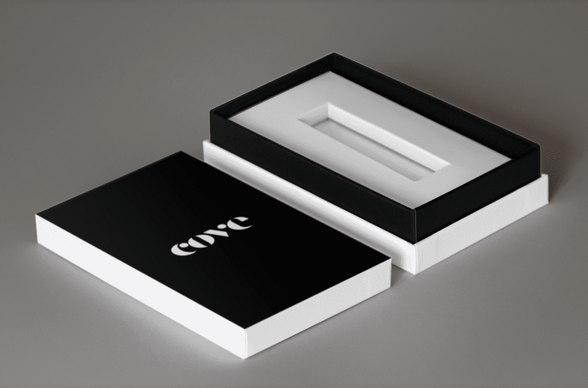
Incorporate innovative structural designs that serve a dual purpose. For example, a stunning box that transforms into a display or serves an additional use post-unboxing conquers the minimalism challenge by merging style with practicality.
Embracing the Movement- Is minimalism the right choice for you?
As the world continues to evolve, so must our packaging approaches. Embracing minimalism and monochrome design isn’t just a trend; it’s a responsive strategy to meet consumer expectations in an increasingly complex marketplace. At “The Mailer Box,” understanding this shift means committing to a philosophy that values simplicity, sustainability, and style.
However, venturing into minimalism comes with its hurdles. Designers must strike a delicate balance between simplicity and functionality. To reach this balance, ask yourself: Is the design intuitive? Does it communicate all necessary information clearly?
Every element should have a purpose—if it doesn’t, the design team should reconsider its inclusion.
By combining these principles, brands can create visually captivating and meaningful custom packaging that resonates well with consumers. So, as you embark on your design journey, remember: in the world of packaging, less can indeed be more. Embrace the power of simplicity, and let your products shine.

Ayesha Khubaib
Ayesha has a diverse experience in areas of marketing and management. Over the years, Ayesha has been involved in the packaging sector in various capacities and now aims to share packaging market insights with her readers
Get in touch with a custom packaging specialist now for a free consultation and instant price quote.

